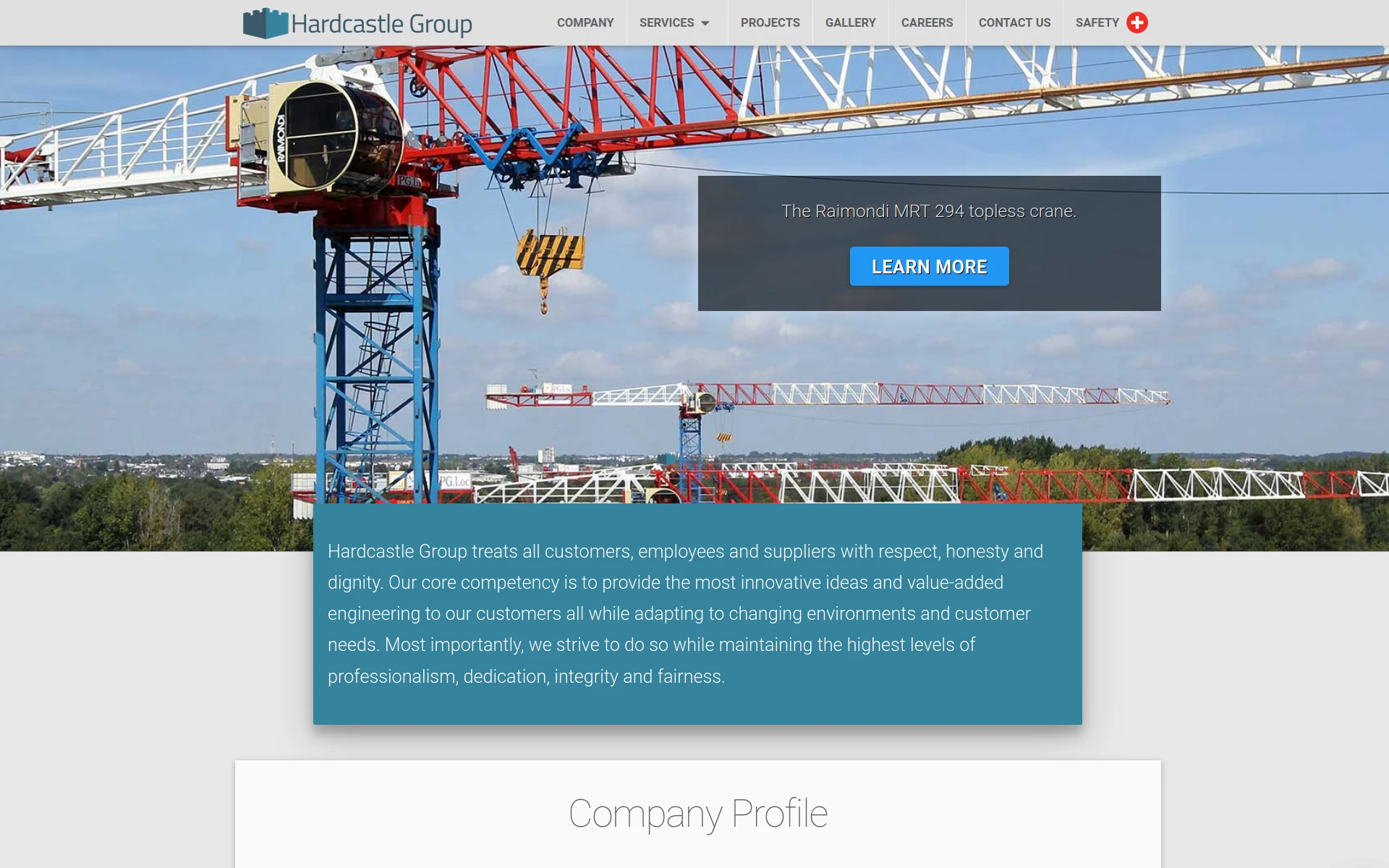
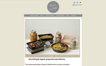
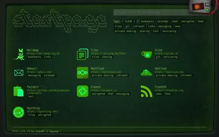
A clean, spacious look that I based off Material Design, but with unique characteristics to give it an identity of it’s own. CSS animations were used sparingly, but still provide an engaging experience.
The site is comprised of various sections, with the prominent two being Projects and Gallery, the latter featuring a lightbox. Safety is important to Hardcastle as a construction company, so this section was given prominence in the navbar by including a red “cross” icon.


